Here are some examples that show up David Carson' characteristic in term of design.
Trek Cover:
 |
| Trek Cover Link: http://www.chadneuman.com/publishedclips/images/david_carson.jpg |
-the numerous layer, typeface, splashing colors in the cover has created extremely balances although it is not looking balanced when all the design elements are combined together.
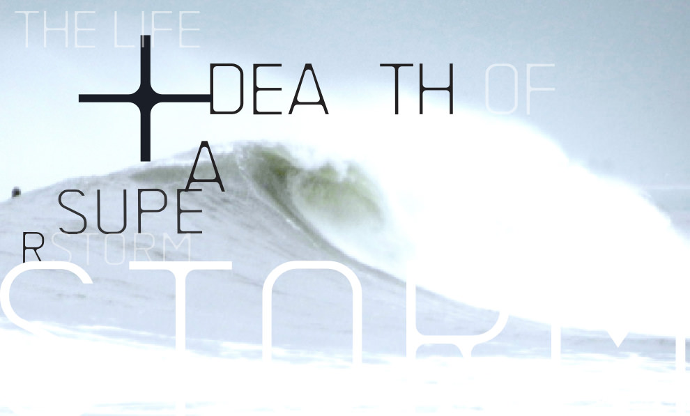
Another sample that show up his characteristics too:
Factory Magazine, London:
 |
| Magazine Factory link:http://www.davidcarsondesign.com/img/mini/magazinefactory_4.jpg |
He add ocean or the blue wave and combined together with typography which gives a great visual impact to the audience to grab their attention.
References Link:


No comments:
Post a Comment