Sunday, 25 August 2013

Legacy

After the invention computer, there are many software are developed such as Fontographer (1986), QuarkXPress(1986), and Adobe Illustrator(1986-1987) for visual presentation and information that could easily incorporate and manipulate both text and image.However, the rise of virtual also started to demolish the traditional printed materials by post modernist artist who inclined to toward devaluation of all value such as the value of authenticity.

The new digital also allowed David Carson to deconstruct his art works, in suppose new visual language. He also abandoned the clean and sharp look of font. Not only that, David Caron as a post modernist,he uses the Grunge font in his design such as Ray Gun Magazine.William Gibson also describe David Carson's work:
" the event horizon of futurity, as close as any windshield, its textures mapped in channel zap and sequential decay of images faxed and refaxed into illegibility.his brave new world abraded onto the concrete of now. This is design pushing back against against the onslaught of an unthinkable present."

David Carson, in the sense of aesthetics, has been dubbed as "post alphabetic aesthetics". His design was chaotic, abstract, and illegible. From the magazine cover that designed by him, he has experimented a lot on typography with image. David Carson has explored the essence of the font , layout and the visual served his design as "post alphabetic aesthetics" 

References Link:
 

David Carson and Deconstruction Similarities

Although David Carson and Deconstruction are separated words but both of them have relationship in term of theory or design concept.

Typography
Both of them are using typography as essential tools in their design. David Carson always emphasis on the typography in the magazine layout that designed by him while deconstruction makes the whole atmosphere of a particular page decided by its subject and type as function  to deliver the mood that the designer wanted to express.

Time
Both Deconstruction and David Carson know that time is golden in modernization , people are busy and rush to nowhere. Therefore, to attract people attention to read and understand the content of the article in a short time, the image must be interesting and give the great impact.

The invention of technology
It help to improve designer when the computer are introduces as the base of production works. This new technology given the designer more freedom when creating their works. Designer can be boost up more creativity and feel more flexible. They also can manipulate image instead of cutting or pasting the image repeatedly.

References link:


Saturday, 24 August 2013

David Carson's design principle

There are some of the David Carson's art works has brought up his own style of design principle. As a designer, everyone must has his/her own design principle and always stick to it. As result, designer has more his /her own space to create new "look" and catch attention of audience. With the design principle, the design only belong to his/her that represent his/her attitude toward the design.

Here are some examples that show up David Carson' characteristic in term of design.
Trek Cover:
Trek Cover
Link: http://www.chadneuman.com/publishedclips/images/david_carson.jpg
-colorful, chaotic environment,
-the numerous layer, typeface, splashing colors in the cover has created extremely balances although it is not looking balanced when all the design elements are combined together.

Another sample that show up his characteristics too:
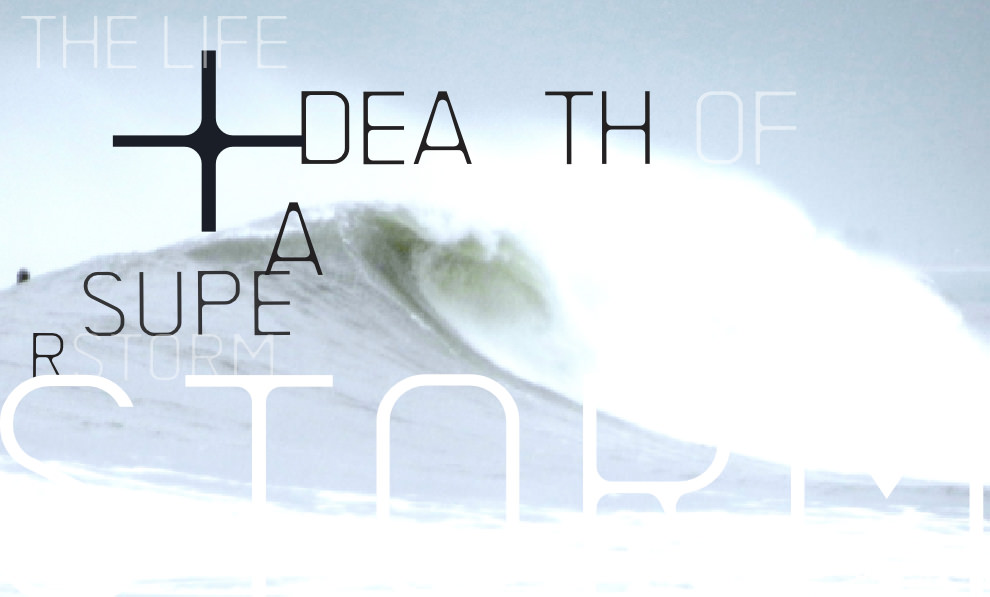
Factory Magazine, London:
Magazine Factory
link:http://www.davidcarsondesign.com/img/mini/magazinefactory_4.jpg
David Carson is using the new type of subject matter in the magazine cover that he designed.
He add ocean or the blue wave and combined together with typography which gives a great visual impact to the audience to grab their attention.

References Link: 

Post Structuralism

David Carson and post structuralism have the indirect relationship between both of them in term of design as David Carson is should be deconstructionist. At the same time, there are educators, philosophers appear to be dismissive of deconstructionist and post structuralism as long as they have associated with the theory of post modernism.

Deconstruction is how an artist try to express out their feeling. In addition, concept or text are one of the essential tools which cannot be deny to help them express. A deconstruction reader attends to suppress tension or conflicts within the text and treat all the natural categories. There is similarities between deconstruction and post structuralism is both of them reject the sense "real" has affect the position of philosophers who share the view that the object and meaning that constitute our existential " reality" are social construction.

Charlene Spretnak (1999) has offered caricature of post scholarship as below:
"The critical orientation known as deconstruction post modernism, constructionism, or constructivism asserts that there is nothing but social construction (for example, language,knowledge system,and culture) in human experience. The philosopher core of deconstruction post modernism is rejection of any sense of real.  

References link:
http://www.latrobe.edu.au/education/downloads/Gough_Price_SAJEE_final.pdf

Monday, 5 August 2013

Grunge Style

Grunge- what is grunge?

 - is not necessary consist of " grungey" design
 - it can be clean cut or combine with one or two grunge aspect and throw them together to make the design interesting and attractive
 - dirty texture and background is almost essential in a grunge style.
 - irregular lines and frames, off center composition make it visually balance
 - subjects such as torn paper, coffee rings/ stain, doodles/ hand written element make the layout in interesting way rather than a plain or equal theme of background
 -subdued, dirty, dull color
- Haphazard and chaotic

David Carson had influenced grunge style in design trends of the 90's.
-He design movement can be considered as grunge but also classified as post modern.
-His design seems to be approached in unorganized but they are actually very organize and balance in terms of design theory.
-the spelling mistake also intentionally.

References:
http://prezi.com/b99iw1v4zwlo/david-carson/

Wednesday, 31 July 2013

Random

Nicole Togneri, presenter of Marlborough Fine Art has claimed that the work of David Carson appeals to younger audience. He knows much about " now". Although he still commands tremendous amount of respect from his fellow designers, it is debatable whether Carson's work would considered by them to be anything remotely resembling "cutting edge".

Immaculee Conception 2001, is both a found poster as well as experimental surface for Carson's overprint of red-inked typographic form

The screen print plays upon what might be read as provocative juxtaposition of David Carson's name with an engraving of French mid-19th century Madonna, enshrined by plump cherubs was another interesting pieces in the show.

reference:
http://www.davidcarsondesign.com/t/2002/05/19/branding/

Monday, 15 July 2013

Post Modernism

David Carson, the most influential graphic design has leading design era to another realm--- Post modernism. He is also the significance of post modernism.

Post modernism--a cultural movement that more rigid, inflexible and irrelevant.In other hand, it can be defined as a cultural, intellectual or artistic state lacking a clear central hierarchy or organizing principle and embodying extreme complexity, contradiction, ambiguity and diversity. It is opposite the theory of modernism.

From the work of David Carson is clearly showed the Post Modernism, he has found a new way to express his idea and thought instead using traditional way. He is not teach by traditional art and design method before,therefore he has more freedom to illustrate. He can find his own rhythm , movement , or emotion and create it in his own composition but not overdoing. From the magazine layout, either the new element he created or the composition he used always make the audience unexpected.

His typography has reveal the post modernism characteristic : he is mixed the serif and sans serif letter forms to come out a hybrid fonts with the abstracted shapes.  He also breaks the traditional grid rules when he arranged the position of the font in layout magazines.

References :


Wednesday, 10 July 2013

Critique

There are people who interested on David Carson design and admired his creativity that boost up new, fresh look in design field. But yet, there are also a number of people do not agree with his grunge style design element and make them feel uncomfortable when looking into it.


So, what they feel when they looking at David Carson design?

-they feel hard to read the article
-it will divert the design student when they follow the grunge style that invent by him
-is impossible to be radical when cooperate with big company like "Nike" , "Microsoft"
-sometimes it might spoil the spread as too complicated


Monday, 8 July 2013

David Carson & Deconstruction

When I research about David Carson,  I found that there are some relationship between his design and deconstruction.

Here are some introduction about Deconstruction
-this concept is introduced by Jacques Derrida
-it is not focus on the themes but rather on the linguistic and institutional system that appear on the production  
 of text
- it also affected many field either music, art, architecture, typography and others
-there are two principle appear in the deconstruction: the first principle is people think and express their
 idea or feeling in opposite terms. For example: positive and negative. Next principle is if there are no second
 the first will always not recognize by others. The second is always support the first

 Therefore, in design field, deconstruction is appeared for designer have more space to express their
 creativity and explore their style in design. David Carson, as a successful typographer have achieve the   deconstruction style in his art work.

Here are some question pop up from my mind:
1. how David Carson art works and deconstruction related?
    - David Carson's typography?
    - His own design theory and deconstruction theory?

2.Can David Carson be proved as deconstruction?
    -it might not clarify as deconstructionist
    -maybe he only come out his own style with his own thought

3 Is there any common point between David Carson design and the Deconstruction?
   -characteristic of both design?

References link:
-http://cardinalscholar.bsu.edu/bitstream/handle/193096/1/W46_2002WhiteheadLydiaE.pdf
-http://www.idemployee.id.tue.nl/g.w.m.rauterberg/conferences/cd_donotopen/adc/final_paper/551.pdf

Sunday, 23 June 2013

David Carson- my inspired artist

Back to my C&CS1 essay assignment, I choose the topic about find one inspired artist. Finally, i choose David Carson as he is famous typographer and also profession in surfing. He was art director for Ray Gun magazine.Not only that, he had given many lectures to student in different places.

Here are some reasons that i choose David Carson as my inspired artist.

- his passion in deign that he insist to join this field although he is not graduated from any design school 
  as he found his interest and his decision had change his life and become a successful designer.

-his dare to discover new element in design, that he broke up the traditional concept and bring out the new    
 and fresh look to people.
( for example, he add " beach culture" or 'surfing' in magazines which he handled)

-he is also different among the designer
 He has his own style and  art direction. Not only that, he breaks the traditional and conservative mind and 
 his outcome is always unexpected which catch people attention.
Below are the images of sketches to choose the inspired artist.


rough sketch 1 

rough sketch 2 

Monday, 10 June 2013

Helvetica Report

After watching the video showed by lecturer, there are different artists have their own opinion about this font- Helvetica. When think of the first impression towards the Helvetica, thick, bold, uniform, unison, and the equally spacing between the letters pop up in my mind.

Helvetica plays an important role for people where some of the people are not so care about the aesthetic but they only care whether the things work or not. The usefulness of an object is what some of the people concern about it. Therefore, in my mind, Helvetica is successfully bring out the message to every people as it is clarify enough to let people read or see through it. In the aspect of readability and legibility, Helvetica has made it. The font is not too exaggerating and not disgusting at all. The individual letter can stand out itself but also can combine together to form a word or sentences. It makes me feel comfortable when read the font and i think comfortable is important aspect when read out a sentence.In the video, i can see the signboard, shop's name are using the Helvetica font. This shows that Helvetica is suit people and at the same time it clearly prove that Helvetica has capability to catch people's attention to this typeface. 


When Helvetica font arise, people start to pay attention about importance of typeface and bring out the new design of different typeface. However, there are some artist are disagree with this font. For an example, Erwin Berkins, he dislike the font as he knew that everyone is using the same typeface and face it every time, is kind of bored.Another artist is Paula Scher,she claimed that the vietnam war and helvetica font have relationship in both of them.Therefore, she is refused to use the helvetica font.

Not only that, this font also used in campaign poster. It can strongly stands out the people's voice about the country. With Helvetica, the people can express their desire and hopes which are needed from their own country. So, there are two campaign poster that using helvetica font. One of the poster is about the " Kebersihan Bandaraya" in Malaysia and the other is about the Barack Obama campaign. When i see both poster, my eyes are fall on the Barack Obama poster. The red and blue hues in the poster are give out contrast and more easy to catch people attention while another poster using white and yellow hues, it not give out so much contrast. For the position of the font in Obama poster, the font is placed in the centre of the poster, it easy to show up the message about the poster while another poster the font is placed at side and it takes time for me to read the message on the poster due to the long sentences compare to other poster.

Conclusion, Helvetica is played important role to bring out the message for people to read and understand in the same time. It does not grab people precious time which take their long time to read and understand the meaning. So, we should appreciate the Helvetica font.

Saturday, 1 June 2013

Struggling for the topic!

Essay topic of C&CS1


For the assignment Critical and Cultural Studies 1,  i was confused to choose which topic as my essay.
After looking all the topics given in the assignment brief, there are 2 topics of the essays still need to finalize which topic to choose.

The first topic is discuss the work of designer, illustrator or typographer, how the outcome have been influenced by the theories of modernism or post- modernism. Explain how and why these ideas emerge through the work using relevant examples and analysis the output of chosen practitioner.

On other hand, the second topic is about Bauhaus, which is we need to study the role of Bauhaus in the history of graphic design and explain its significance. Discuss the theory or concept or world views that they shared and how its influenced to current design scene.

so, after seeking teacher's advice, i decided to choose the first topic, about the work of designer.